当ブログのコンテンツ・情報について、できる限り正確な情報を提供するように努めておりますが、正確性や安全性を保証するものではありません。
当サイトに掲載された内容によって生じた損害等の一切の責任を負いかねますので、予めご了承ください。
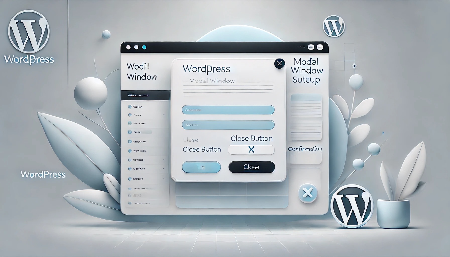
WordPressでモーダルウィンドウを設置する方法
この記事ではWordPressでモーダルウィンドウを設置する方法を解説します。
モーダルウィンドウとは、ウェブページ上に重ねて表示される小さなウィンドウのことで、ユーザーが特定の操作を行わない限りページの他の部分が操作できなくなります。一般的に、重要なメッセージを表示したり、特定のアクションを促したりするために使用されます。
目次
モーダルウィンドウの設置方法
WordPressにモーダルウィンドウを設置するには、ここでは、クリック式、スクロール式の2種類のモーダルウィンドウの実装方法について解説します。
HTML、CSSを設置する場所は「WordPressでフローティングバナー・ボタンを設置する方法」と同じです。JavaScriptは「WordPressでJavaScriptを読み込む方法3選」を参考にしてください。
クリック式モーダルウィンドウ
クリック式モーダルウィンドウは、ボタンやリンクをクリックすることで表示されます。以下のコードを使用して、クリックで表示されるモーダルウィンドウを設置できます。
<button id="open-modal">モーダルを開く</button>

<div id="modal" class="modal" style="display:none;">
  <div class="modal-content">
    <span id="close-modal">×</span>
    <p>モーダルウィンドウのコンテンツです。</p>
  </div>
</div>
/* モーダルの背景を薄暗く */
.modal {
position: fixed;
z-index: 1;
left: 0;
top: 0;
width: 100%;
height: 100%;
background-color: rgba(0, 0, 0, 0.5); /* 半透明の黒 */
display: flex;
justify-content: center;
align-items: center;
}
/* モーダルウィンドウの内容 */
.modal-content {
background-color: white;
padding: 20px;
border-radius: 10px;
width: 50%; /* 横幅の半分 */
height: 50%; /* 縦幅の半分 */
box-shadow: 0 4px 8px rgba(0, 0, 0, 0.2);
position: relative;
}
/* モーダルを閉じるボタン */
#close-modal {
position: absolute;
top: 10px;
right: 20px;
font-size: 24px;
cursor: pointer;
}document.getElementById('open-modal').onclick = function() {
document.getElementById('modal').style.display = 'flex'; // モーダルを表示
}
document.getElementById('close-modal').onclick = function() {
document.getElementById('modal').style.display = 'none'; // モーダルを非表示
}
// モーダルの背景をクリックすると閉じる
document.getElementById('modal').onclick = function(event) {
if (event.target === document.getElementById('modal')) {
document.getElementById('modal').style.display = 'none';
}
}スクロール式モーダルウィンドウ
スクロール式モーダルウィンドウは、ユーザーがページを一定量スクロールしたときに自動的に表示されるモーダルウィンドウです。以下のコードを使用して、スクロールに応じてモーダルウィンドウを表示することができます。
ここではid="scroll-modal"を含む要素に達したらモーダルウィンドウが開くようにしています。
<div id="modal" class="modal" style="display:none;">
  <div class="modal-content">
    <span id="close-modal">×</span>
    <p>モーダルウィンドウのコンテンツです。</p>
  </div>
</div>
/* モーダルの背景を薄暗く */
.modal {
position: fixed;
z-index: 1;
left: 0;
top: 0;
width: 100%;
height: 100%;
background-color: rgba(0, 0, 0, 0.5); /* 半透明の黒 */
display: flex;
justify-content: center;
align-items: center;
}
/* モーダルウィンドウの内容 */
.modal-content {
background-color: white;
padding: 20px;
border-radius: 10px;
width: 50%; /* 横幅の半分 */
height: 50%; /* 縦幅の半分 */
box-shadow: 0 4px 8px rgba(0, 0, 0, 0.2);
position: relative;
}
/* モーダルを閉じるボタン */
#close-modal {
position: absolute;
top: 10px;
right: 20px;
font-size: 24px;
cursor: pointer;
}// モーダルの表示
function showModal() {
document.getElementById('modal').style.display = 'flex';
}
// モーダルを閉じる
document.getElementById('close-modal').onclick = function() {
document.getElementById('modal').style.display = 'none';
}
// モーダルの背景をクリックすると閉じる
document.getElementById('modal').onclick = function(event) {
if (event.target === document.getElementById('modal')) {
document.getElementById('modal').style.display = 'none';
}
}
// IntersectionObserverを使ってスクロール検知
let observer = new IntersectionObserver(function(entries) {
if (entries[0].isIntersecting) {
showModal(); // スクロールして要素が見えたらモーダルを表示
observer.disconnect(); // 一度モーダルを表示したらObserverを停止
}
}, { threshold: 1.0 }); // 100%要素が見えるタイミングでトリガー
// 監視する要素を指定
observer.observe(document.getElementById('scroll-modal'));また、ページ全体の半分(bodyの半分)に達したら、開くようにはJavaScriptを以下のようにします。
// モーダルの表示
function showModal() {
  document.getElementById('modal').style.display = 'flex';
}

// モーダルを閉じる
document.getElementById('close-modal').onclick = function() {
  document.getElementById('modal').style.display = 'none';
}

// モーダルの背景をクリックすると閉じる
document.getElementById('modal').onclick = function(event) {
  if (event.target === document.getElementById('modal')) {
    document.getElementById('modal').style.display = 'none';
  }
}

// スクロール検知
window.addEventListener('scroll', function() {
  // body の全体の高さとスクロール位置を取得
  let scrollPosition = window.scrollY + window.innerHeight;
  let bodyHeight = document.body.scrollHeight;

  // ページの半分を超えたらモーダルを表示
  if (scrollPosition >= bodyHeight / 2) {
    showModal();
    // 一度表示したらイベントリスナーを削除
    window.removeEventListener('scroll', arguments.callee);
  }
});
当サイトのモーダルウィンドウ サンプルコード
当サイトでは以下のようにコーディングし、ページの半分に達したらランダムにモーダルウィンドウが表示するようにしています。ただし、記事によって開くモーダルウィンドウは変えており、この実装はプラグイン「Widget Options」を使用しています。
html:
<!-- wp:html -->
<div id="pr-modal" class="pr-modal" style="display:none;">
    <div class="pr-modal-content">
        <span id="close-modal">×</span>
        <!-- /wp:html -->

        <!-- wp:html -->
        <div id="modal-content-1">
            <!-- /wp:html -->

            <!-- wp:paragraph -->
            <p>モーダルウィンドウコンテンツ1</p>
            <!-- /wp:paragraph -->

            <!-- wp:html -->
        </div>
        <!-- /wp:html -->

        <!-- wp:html -->
        <div id="modal-content-2">
            <!-- /wp:html -->

            <!-- wp:paragraph -->
            <p>モーダルウィンドウコンテンツ2</p>
            <!-- /wp:paragraph -->

            <!-- wp:html -->
        </div>
        <!-- /wp:html -->

        <!-- wp:html -->
    </div>
</div>
<!-- /wp:html -->
style.css:
/* モーダルの背景を薄暗く */
.pr-modal {
  position: fixed;
  z-index: 1;
  left: 0;
  top: 0;
  width: 100%;
  height: 100%;
  background-color: rgba(0, 0, 0, 0.5); /* 半透明の黒 */
  display: flex;
  justify-content: center;
  align-items: center;
}

/* モーダルウィンドウの内容 */
.pr-modal-content {
  background-color: white;
  padding: 20px;
  border-radius: 10px;
  width: 40%;
  height: auto;
  max-height: auto;
  box-shadow: 0 4px 8px rgba(0, 0, 0, 0.2);
  position: relative;
}

/* モーダルを閉じるボタン */
#close-modal {
  position: absolute;
  top: 10px;
  right: 20px;
  font-size: 24px;
  cursor: pointer;
}
pr-modal.js:
// モーダルの表示
function showModal() {
    document.getElementById('pr-modal').style.display = 'flex';
}

// モーダルを閉じる
document.getElementById('close-modal').onclick = function() {
    document.getElementById('pr-modal').style.display = 'none';
}

// ランダムにコンテンツを表示する
function showRandomContent() {
    const contents = document.querySelectorAll('[id^="modal-content-"]'); // "modal-content-" で始まる要素をすべて取得
    const totalContents = contents.length; // 要素の数を取得
    const randomIndex = Math.floor(Math.random() * totalContents); // 0からtotalContents-1までのランダム数

    // すべてのコンテンツを非表示にし、ランダムに選ばれたコンテンツだけを表示
    contents.forEach(content => content.style.display = 'none');
    contents[randomIndex].style.display = 'block';
}

// スクロール量を監視してモーダルを表示
window.addEventListener('scroll', function() {
    const scrollPosition = window.scrollY + window.innerHeight;
    const halfwayPoint = document.body.scrollHeight / 2;

    if (scrollPosition >= halfwayPoint) {
        showRandomContent(); // ランダムにコンテンツを表示
        showModal(); // モーダル表示
        window.removeEventListener('scroll', arguments.callee); // イベント解除
    }
});
function.php:
function enqueue_custom_scripts() {
    // モーダル
    wp_enqueue_script( 'pr-modal.js', get_stylesheet_directory_uri() . '/js/pr-modal.js', array(), false, true );
}
add_action('wp_enqueue_scripts', 'enqueue_custom_scripts');
まとめ
これらのモーダルウィンドウの設置方法を活用すれば、ユーザーの注意を引きたい場面や重要な情報を伝えるときに役立ちます。必要に応じてデザインや表示タイミングを調整し、効果的に活用しましょう。